Three hours. That’s how long I wasted last Tuesday manually synthesizing user interview notes from five stakeholder conversations.
Then I remembered I had Claude open in another tab.
Ten minutes later, I had themed insights, prioritized findings, and supporting quotes organized by impact. My project lead asked how I worked so fast. I told her the truth: I stopped doing things the hard way.
Here’s what nobody tells you about using AI for design work. The tool doesn’t matter nearly as much as knowing exactly what to ask for. Nielsen Norman Group found that designers using AI effectively save an average of 12 hours per week, but only when they use structured prompts.
So let’s cut through the noise. These ten Claude prompts for UX designers handle the grunt work that eats up your calendar. Copy them, customize them, and get back to solving actual design problems.
Why most designers waste Claude’s potential
Generic prompts get you generic outputs. “Help me with my design” produces nothing useful.
Meanwhile, structured prompts that define role, context, and deliverables? Those create actual artifacts you can drop into Figma or present to stakeholders tomorrow morning.
The secret is specificity. Give Claude constraints, examples, and clear success criteria. That’s how you turn a chatbot into a design partner.
Research synthesis that actually finds patterns
User interviews generate mountains of qualitative data. Then that data sits in Google Docs for weeks because synthesis takes forever.
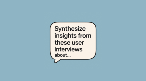
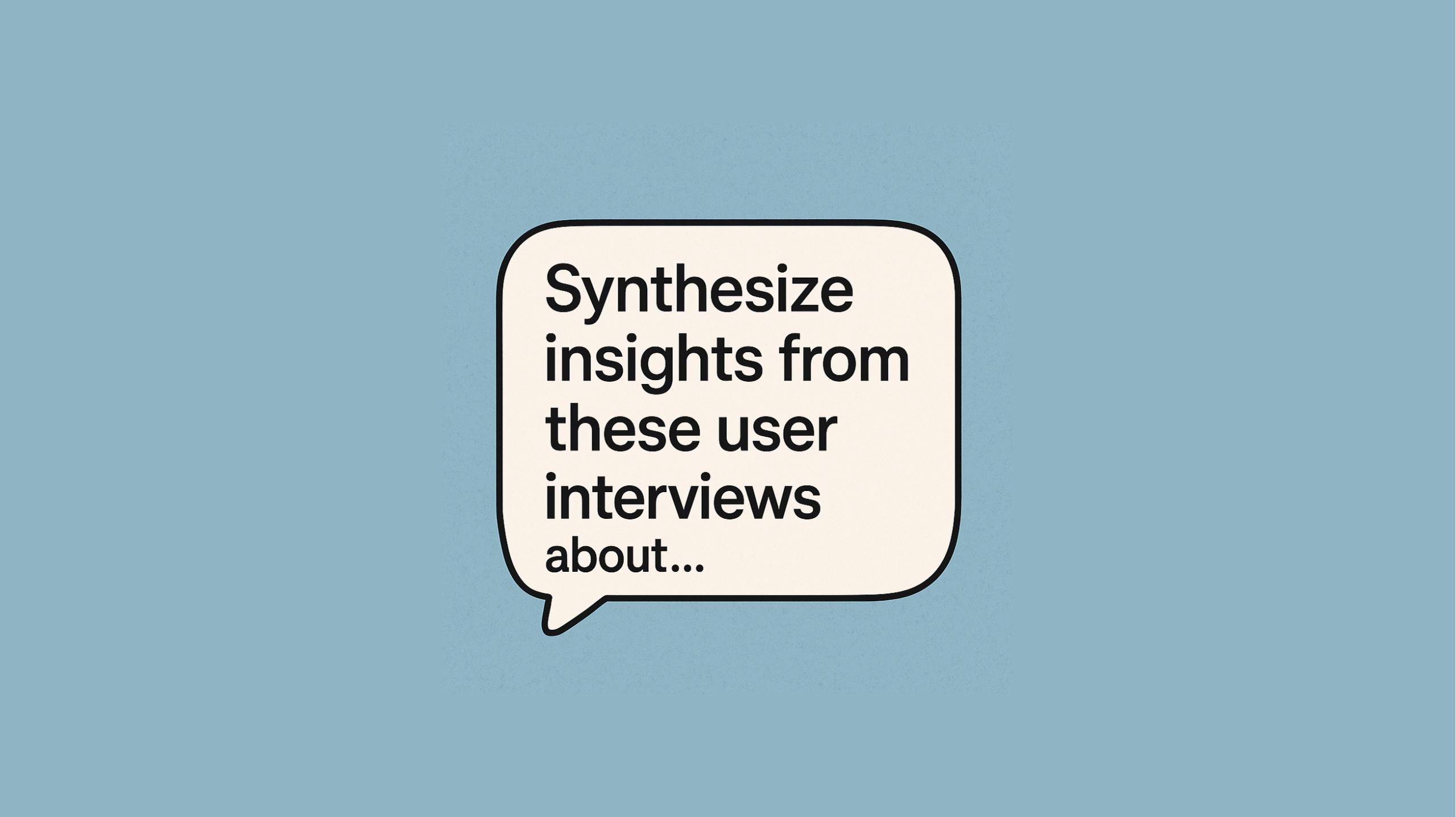
Try this prompt: “Synthesize insights from these user interviews about [product or feature]. Code each quote by theme and sentiment. Deliver a ranked list of the top seven issues with illustrative quotes and a 100-word opportunity summary for each. Prioritize based on frequency and impact on user success.”
Paste your raw interview transcripts after the prompt. Claude organizes the chaos into themed findings with supporting evidence in minutes.
Therefore, you skip straight to sharing insights with your team instead of spending three days on manual coding. I used this last month to analyze 15 customer interviews for a fintech product. What would’ve taken me a week took 20 minutes.
Survey questions that uncover real user needs
Crafting effective survey questions from scratch burns through time you don’t have. Bad questions lead to useless data. However, good questions reveal friction points and opportunities.
Use this prompt: “Act as a seasoned UX researcher with experience at Fortune 500 companies. Generate a comprehensive set of survey questions for understanding user experience with [type of product]. The questions should uncover behaviors, preferences, and pain points. Focus on areas that reveal both friction and delight in the user journey. Include 5 demographic questions, 10 behavioral questions, and 5 open-ended qualitative questions.”
Replace the brackets with your specific product details. Claude generates 20+ targeted questions covering demographics, behaviors, and open-ended feedback.
Additionally, the mix of question types helps you gather both quantitative metrics and qualitative insights. This prompt works because it assigns Claude an expert role and defines clear objectives.
Design critiques without the ego damage
Sometimes you need honest feedback but your team is too nice, too busy, or too invested in the current direction.
This prompt delivers brutal honesty: “You’re a senior product designer with 10+ years experience reviewing this [describe interface or attach screenshot]. Provide detailed feedback on usability, visual hierarchy, mobile responsiveness, accessibility standards (WCAG 2.1 AA), and brand consistency. Identify three specific improvements with actionable recommendations and rationale for each. Be direct about what’s not working.”
Claude will roast your design constructively. No feelings hurt, just clear improvement paths.
Furthermore, you can iterate immediately on the feedback. Ask follow-up questions about implementation or request alternative approaches. Smashing Magazine notes that AI-powered critique helps designers catch accessibility issues they might otherwise miss.
Competitive analysis that spots market gaps
Manual competitive research takes hours of clicking through competitor sites and reading reviews. Meanwhile, deadlines keep getting closer.
Try this: “Conduct a competitive analysis of the top five [product category] platforms. Identify key features, pricing models, strengths, weaknesses, and user complaints based on public information. Provide three actionable design insights to differentiate our product by addressing unmet needs, simplifying complex workflows, or improving specific user flows that competitors handle poorly.”
The output delivers strategic direction, not just a feature checklist. You spot opportunities competitors ignore.
Therefore, your roadmap prioritizes genuine market gaps rather than playing feature parity catch-up. This approach aligns with what I’ve seen work at enterprise companies where differentiation matters more than matching competitor features one-to-one.
Personas grounded in actual research data
Personas guide design decisions but creating them from research findings is tedious. Generic personas like “busy professional Sarah” don’t help anyone.
Use this prompt: “As an experienced UX strategist, create a detailed user persona for [type of product] based on this research data [paste key findings from interviews, surveys, analytics]. Include demographics, behaviors, needs, motivations, pain points, goals, and tech comfort level. Make this persona specific enough to guide design decisions about [specific feature or flow]. Include a day-in-the-life scenario showing when and why they’d use our product.”
Claude synthesizes your research into a coherent character with specific details that actually inform decisions. The scenario helps teams visualize real usage contexts.
Additionally, specific personas work better for 0-1 product development where every decision compounds. For more thoughts on research-driven design, check out other articles here about connecting user insights to product strategy.
User journey maps with emotional beats identified
Journey mapping reveals gaps between intended experience and reality. However, comprehensive journey maps take forever to build from scratch.
This prompt creates the framework: “As a UX strategist, outline a detailed user journey for [specific user action] on a [type of product used by specific audience]. Map each step from initial awareness through task completion and post-task reflection. For each stage, identify: user goals, emotional state, potential barriers, touchpoints, opportunities for positive intervention. Flag the three highest-impact moments where small improvements would dramatically improve satisfaction or reduce friction.”
You get a comprehensive journey map with strategic insights baked in. The emotional states help you prioritize where to invest design effort.
Meanwhile, the high-impact moment identification helps you focus resources. Use this as your foundation and refine based on actual user testing. Journey maps built this way cut planning time in half while maintaining depth.
Onboarding flows that respect user time
Most onboarding experiences overwhelm users with information they don’t need yet. People abandon products during onboarding more than any other flow.
Try this prompt: “You’re a UX strategist designing an onboarding flow for [type of tool used by specific audience with specific job to be done]. Create a step-by-step flow that’s frictionless and value-focused. Include key steps, tooltip content, microcopy for each screen, and personalization triggers based on user responses. Show clear value within the first 60 seconds. Explain where and why to personalize the experience based on user role, intent, or behavior signals.”
The result considers both business goals and user needs when structuring the sequence. Claude balances teaching users with getting them to value quickly.
Furthermore, the personalization triggers help you scale onboarding without maintaining ten different versions. Progressive disclosure keeps cognitive load manageable. Appcues research shows that value-first onboarding increases activation rates by 40%.
Design system documentation before chaos sets in
Design systems prevent inconsistency hell. Documentation always falls to the bottom of the priority list until you have three different button styles and nobody knows which is correct.
Use this prompt: “As an experienced product designer, create comprehensive design system guidelines for [type of product]. Cover color palette with hex codes and usage rules, typography scale with font families and weights, icon style and sizing, spacing system, component patterns for buttons/inputs/cards, interactive states for all components, and accessibility requirements including color contrast ratios. Include usage examples for designers and implementation notes for developers. Make guidelines clear enough that a new team member could implement components correctly on day one without asking questions.”
Claude generates documentation covering the essentials. You’ll still customize for your brand, but the structure exists.
Additionally, clear guidelines reduce endless Slack conversations about spacing values and button hierarchies. Teams move faster when everyone references the same source of truth. Design systems built this way scale better as teams grow.
Stakeholder-ready presentation copy
Stakeholders want to see polished concepts. They struggle to envision final products from wireframes alone.
This prompt delivers presentation-ready content: “You’re a senior product designer creating hero section copy for a landing page. The product is [describe your product, target audience, and key benefit]. Generate three options, each with: headline (under 10 words), subheading (under 20 words), primary CTA, and secondary CTA. Use benefit-focused language that converts. For each option, include layout recommendations for desktop and mobile, plus brief rationale explaining the strategic angle and psychological principles being used.”
You get multiple directions with strategic reasoning behind each. Pick the strongest or combine elements from several versions.
Therefore, you walk into stakeholder meetings with polished options that demonstrate vision. The layout suggestions help non-designers visualize execution. Copy quality matters because it demonstrates your understanding of the user’s mental model and what motivates them to act.
Error messages that actually help users
Error messages are where good UX goes to die. Most are technical, unhelpful, and make users feel intimidated when things break.
Try this final prompt: “Write five UX error messages for [specific form, action, or system error] that are friendly, helpful, and non-technical. For each error, explain what went wrong in plain language and provide clear next steps to fix it. Match the tone of [reference product known for great microcopy like Mailchimp, Stripe, or Duolingo]. Include when to show each message and what triggered the error state.”
You get human-sounding messages that reduce support tickets and user frustration. No more “Error 404” nonsense that leaves people confused.
Additionally, these messages work as templates you can adapt across your product for consistency. Good error messaging builds trust by treating mistakes as normal parts of the experience rather than user failures.
Making these Claude prompts work for your workflow
Here’s the reality about AI prompts. They’re starting points, not finished products. The best results come from treating Claude like a junior designer who needs direction.
Take the first response and refine it. Ask follow-up questions, challenge assumptions, or request format changes. Iteration matters more than getting perfect output on the first try.
Some practical tips for better outputs:
- Replace bracketed placeholders with detailed context about your product, users, and constraints
- Include brand guidelines, technical limitations, or business requirements upfront
- Request three options so you can compare approaches and pick the strongest elements
- Ask Claude to explain its reasoning so you learn strategic thinking behind recommendations
- Use outputs as drafts that you shape with your expertise and deep knowledge of users
- Build a personal prompt library by saving customized versions that work well for recurring tasks
Remember, AI handles repetitive cognitive work so you focus on creative problem solving that makes design interesting. That’s the entire point of these tools.
What to try first with Claude prompts for UX designers
Start with whichever prompt solves your biggest time sink today. Drowning in research synthesis? Use that prompt. Stuck writing microcopy? Try the error message one.
Pick one prompt and customize it for your specific context. You’ll figure out the rhythm within a few attempts. The key is consistent use, not perfect execution.
For more on connecting design thinking to product outcomes, explore additional resources here. I regularly share practical approaches for research-driven design at enterprise scale based on work with companies like Prudential, Disney, and Cisco.
The designers winning right now aren’t the ones with perfect portfolios or the fanciest tools. They’re the ones who leverage AI to do better work in less time, then invest saved hours into solving harder problems.
Your move.
Resources for leveling up your prompting skills
Want to improve your prompt engineering even further? Claude’s official documentation has excellent guides on prompt structure and best practices for getting quality outputs.
The Maze guide on AI prompts for user research goes deeper into research-specific applications. Bookmark it if you work heavily in research.
Interaction Design Foundation offers broader context on AI integration across the design process, from ideation through testing.
Finally, experiment with frameworks like REFINE (Role, Expectation, Format, Iterate, Nuance, Example) when crafting complex prompts. Structure helps AI understand exactly what you need and deliver outputs that require minimal revision.