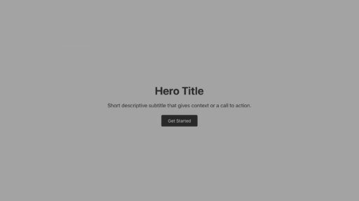
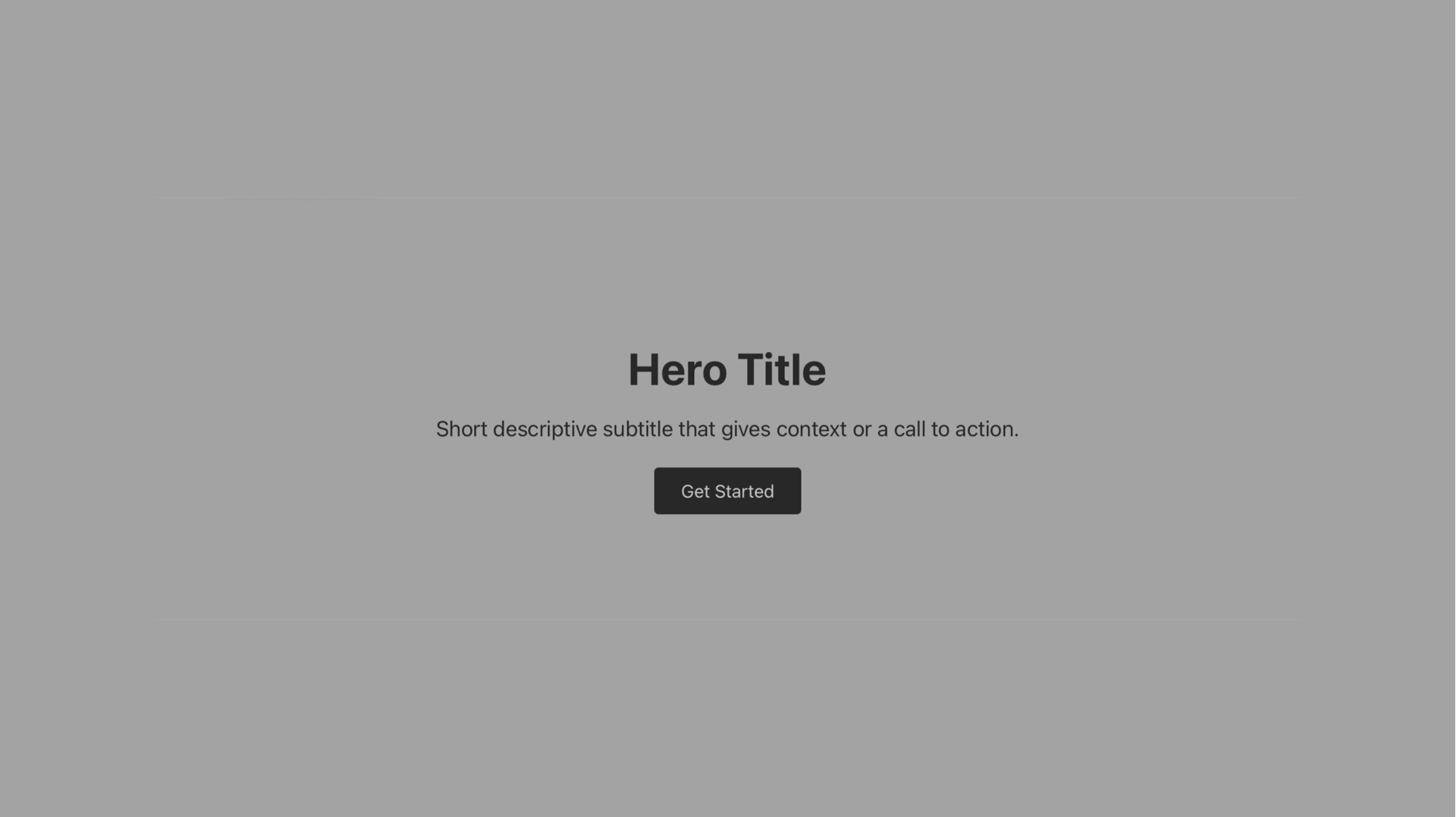
Well, kind of. So everyone’s still slapping massive hero images on their homepages like it’s 2015. Meanwhile, the companies actually making money? They ditched that shit years ago. The full-width hero isn’t technically dead, but it’s damn close. What’s working instead are approaches boosting conversions by 20-102% while cutting load times by up to 76%.
Most successful SaaS, B2B, and tech sites are using split layouts, bento grids, product interface previews, and typography-first designs. Real testing shows these alternatives destroy traditional heroes in performance while keeping users more engaged.
Now, luxury brands, hotels, real estate, and creative portfolios? They’re still all-in on full-width imagery. Makes sense. Their whole game is emotional impact and making you feel something.
Why This Shift Happened (And Why It Matters to You)
Three things killed the traditional hero. Mobile traffic hit 62.54% of all web visits in late 2024. Google made Core Web Vitals a ranking factor. And every A/B test kept showing that clear messaging with big CTAs beats pretty pictures.
Meanwhile, award-winning sites are pushing boundaries with WebGL 3D experiences, AI-driven personalization, and interactive scroll animations that create engagement without sacrificing performance. The gap between what wins design awards and what converts users is finally closing.
What Designers Are Actually Building Instead
Product Interface Previews Beat Stock Photography
The most common alternative across modern SaaS and B2B websites? Show the actual damn product. Linear showcases an animated preview of their actual product with a “liquid glass” design system. Figma uses modular sections featuring real product screenshots instead of aspirational photography.
These companies realized something crucial: showing the actual product communicates value faster than any lifestyle photograph could. It’s the same principle I’ve applied when designing enterprise products – users want to see what they’re getting, not some generic happy people pointing at laptops.
Split Layouts That Actually Convert
Stripe pioneered what’s becoming the gold standard: diagonal split layouts with animated product demonstrations. Instead of a static hero image, their homepage features animated payment flows, gradients, and dynamic visual elements.
The results? Companies using similar split-screen designs report conversion increases of 24-35% compared to traditional full-width heroes. Plus, the split approach solves a critical mobile problem by allowing better control over how content stacks on smaller screens.
Bento Grids (The Breakout Trend of 2024)
Bento grid layouts emerged as 2024’s breakout trend, inspired by Apple’s design language. These modular, card-based systems organize content into distinct rectangular compartments of varying sizes. Companies like Notion, Procreate, and multiple B2B platforms adopted this pattern for one reason: flexibility.
Content teams can rearrange modules without developer intervention. You can A/B test individual sections. Design consistency stays intact across pages. The technical implementation uses CSS Grid with varying grid-column spans, typically with 16-24px gaps and 8px border radius for that signature rounded corner look.
Typography-Focused Designs That Load Fast
Rather than using large background images, modern sites lead with expressive typography, color gradients, and generous whitespace. Research shows these designs load 76% faster than image-heavy alternatives while improving accessibility scores.
A GoStellar A/B test found that abstract gradient backgrounds improved Largest Contentful Paint by 1.1 seconds while maintaining the same conversion rate. For SaaS companies prioritizing clear value propositions over emotional branding, this approach proves ideal.
Specific Patterns Replacing Hero Images Right Now
Search-First Design
Search-first homepage design is gaining momentum in e-commerce and content-heavy platforms. Airbnb’s prominent search bar with destination, dates, and guest parameters exemplifies this approach.
The logic is compelling: if users arrive knowing what they want, why make them scroll past decorative imagery? Sites implementing search-first design report users reaching their goals 17-30% faster with lower bounce rates.
Video Backgrounds (But Done Right This Time)
Video backgrounds evolved from the maligned auto-playing videos of 2015. Modern implementations are sophisticated: luxury brands use subtle footage under 2MB with WebM and MP4 fallbacks. The key change? Treating video as environmental atmosphere rather than demanding attention.
Hotels report that 87% of marketers say video increased leads and sales in 2024-2025. The critical distinction: these videos enhance rather than replace the core message, and they always include static image fallbacks for mobile users.
Animation and Interactive Elements
The 2024 animation landscape includes 31 distinct types, from WebGL 3D rendering to morphing effects to glassmorphism. GSAP (GreenSock Animation Platform) and Three.js have become standard tools.
The best implementations follow a crucial rule: animations under 300-500ms for UI feedback, using transform and opacity properties for performance, always with reduced-motion alternatives for accessibility.
Content-First Design with Minimal Imagery
Dropbox Business, Freshworks, and trivago exemplify this approach: generous whitespace, strong typographic hierarchy, and imagery only when it serves content. The methodology flips traditional design on its head.
Start with content strategy and user needs, then build visual design around it. Use real content during design (never Lorem Ipsum). Establish a modular content model. Implement responsive content strategy where mobile gets shorter descriptions with essential information only.
The Performance Data You Can’t Ignore
Think with Google’s “Milliseconds Make Millions” study analyzed 37 brands with 30+ million user sessions. A 0.1 second improvement in page speed resulted in retail sites seeing 5.2% more page views per session and 5.7% lower bounce rates.
Each additional 100KB in hero section assets increases bounce rate by 1.8%. Hero videos add an average 1.2 seconds to LCP.
Real Conversion Improvements
The conversion data from companies that redesigned away from traditional heroes is dramatic:
- MailReach achieved 60% higher conversion per session and 82% per user after a complete homepage redesign focusing on clarity
- Triple Crown Corporation saw a 49.73% conversion increase with user-friendly navigation replacing a large hero
- A real estate website moved from 0.5% to 4.5% conversion rate (an 800% improvement) simply by adding a prominent sticky CTA instead of a traditional hero
- Basecamp doubled conversions (102.5% increase) with their complete homepage redesign
- Walmart boosted conversions 20% across all devices with mobile-optimized responsive grids that reduced hero image weight
Mobile Responsiveness Isn’t Optional Anymore
With 62.54% of global traffic from mobile devices, sites with 1920×1280 pixel hero images create terrible experiences. These images don’t resize responsively, background-size: cover causes unnecessary data consumption, and text overlays ruin both image aesthetics and readability.
And get this: 53% of mobile users abandon pages taking longer than 3 seconds to load. Typography-focused designs load 76% faster, providing near-instant core message delivery while visuals fade in progressively.
What UX Researchers Are Actually Saying
Ross Dillon’s September 2025 article on UX Planet crystallizes the critical perspective. He argues full-width hero images “distract users with generic or ambiguous visuals that fail to communicate a clear value proposition, leading to lower engagement.”
He cites a 2024 VWO A/B testing study finding that landing pages with clear text and call-to-action buttons increased conversions by up to 20% compared to image-heavy designs.
Nielsen Norman Group’s updated homepage guidelines take a measured but firm stance. Their guidance on imagery: “Avoid purely decorative or unhelpful graphics, as users tend to skip over them” and “Your homepage is the most valuable real estate on your website, so every image should serve a purpose and add value.”
CrazyEgg, the conversion optimization platform with hundreds of homepage A/B tests, provides a reality check: “At CrazyEgg, we’ve done hundreds of A/B tests on homepages, and hero images don’t move the needle as much as some visual design advocates would claim.”
Industries Where Full-Width Heroes Still Make Sense
Luxury Fashion and Lifestyle Brands
Louis Vuitton uses full-screen hero videos featuring seasonal collections in breathtaking settings. Burberry showcases iconic check-patterned outerwear in immersive video. Dior, Versace, Loro Piana, and Moncler all use captivating full-width visuals because they’re not selling products – they’re selling lifestyle and status.
The images transport users into the brand’s world, signal sophistication, and create the aspirational feeling that drives luxury purchases.
Travel and Hospitality
Properties like Burj Al Arab Jumeirah use panoramic drone shots in full-width video carousels. Four Seasons uses dynamic hero content showcasing different properties. The data supports this: video content increases purchasing decisions by 90%, and hotels need to convey atmosphere, location, and luxury instantly.
With 62.54% of traffic on mobile, these sites implement sophisticated responsive strategies – full video on desktop, optimized stills on mobile, with integrated booking engines directly in hero sections.
Real Estate
Real estate purchases are major investments requiring comprehensive visual information. Buyers need to envision themselves in spaces, appreciate architecture and views, and understand the lifestyle being sold. Statistics show video boosts real estate conversion rates by 80% and influences purchasing decisions by 90%.
Photography and Creative Portfolios
Photographers and creatives need to showcase work at highest quality – the hero image becomes their calling card. The work must speak for itself, and large-scale presentation establishes professional credibility instantly.
The Most Innovative Homepages from the Past Year
Igloo Inc won Awwwards Site of the Year 2024 by accomplishing something rarely seen: combining an immersive 3D WebGL experience with easy-to-navigate scroll interaction. The jury specifically noted: “It combines an immersive 3D experience with an easy to navigate, scroll interaction” – solving the longstanding tension between sophisticated visuals and usability.
AI integration represents 2024-2025’s most transformative innovation. Taskade features full-screen animation showing their AI tool powering workplace automation. Scale’s homepage includes a standout animated 3D model divided into components corresponding to tabbed content. Writer uses bright neons and interactive tabbed sections rotating through use cases.
These aren’t just using AI as a feature – AI personalizes the hero content based on user behavior, location, and preferences in real-time. It’s the kind of innovation I’ve been tracking in my design and tech writing, where the line between personalization and automation keeps getting blurrier.
At the End of the Day
Traditional full-width hero images tank your performance. The data’s clear: 0.1 second speed improvements correlate with 8-10% conversion increases. That’s real money.
But the choice isn’t hero images versus nothing. It’s about whether you’re designing based on what actually works or just copying what everyone else did five years ago.
Luxury, hospitality, real estate, creative portfolios? They still need full-width imagery because their whole business model runs on emotion and aspiration. But if you’re building SaaS, B2B, e-commerce, or content platforms, the alternatives consistently perform better.
The best homepages in 2025 load core content in under 2.5 seconds, communicate value without making users decode an image, work great on mobile, have obvious CTAs, and use modular systems you can keep testing and improving.
Whether that’s split layouts, bento grids, product previews, or typography-first approaches doesn’t matter as much as the fundamentals. These patterns outperform traditional heroes in every metric that matters.
Where things are headed: AI-driven personalization where homepages adapt to individual users, WebGL 3D experiences that don’t sacrifice usability, component-based systems that eliminate the whole “homepage redesign” concept, and performance budgets treated as requirements, not suggestions.
Test your assumptions. Create variants with traditional heroes, split layouts, and typography-first approaches. Measure time to first interaction, scroll depth, mobile bounce rates, and Core Web Vitals scores. Not just conversion rates.
The companies winning in 2025 treat their homepage as something that evolves based on testing, not a monument to whatever design trend looked cool in Figma.