For years, I designed websites with massive hero images. Beautiful, full-screen visuals that made stakeholders go “wow” in every presentation.
Then I looked at the data. People were bouncing before the images even loaded.
The Confession Every Designer Needs to Make
Look, I get it. You spend hours finding the perfect stock photo. The client loves it. The CEO shows it off at the board meeting. Everyone feels good.
Meanwhile, actual users are watching a loading spinner. They’re wondering what your company does while waiting for a 3MB image to render. They’re already reaching for the back button.
I learned this the hard way at Prudential. We had gorgeous hero sections planned for their digital onboarding. Stunning visuals that communicated trust and stability. But you know what communicated trust better? Getting users to their information quickly.
When Pretty Becomes a Problem
The uncomfortable truth is that full-screen hero images solve a design problem, not a user problem. They make executives feel confident. They fill up space in presentations. However, they rarely help someone accomplish their actual goal.
Think about the last time you visited a website looking for specific information. Did you want to admire their photography? Or did you want to find what you came for and move on?
Users don’t browse websites like art galleries anymore. They scan like they’re on a mission. Therefore, every second spent loading a massive hero image is a second they could be getting their answer somewhere else.
The Speed Revolution Nobody Talks About
Here’s what changed. Ten years ago, a beautiful homepage was a competitive advantage. Today, according to Google Core Web Vitals, slow-loading sites get penalized in search rankings.
The data tells a brutal story. According to Google research, 53% of mobile users abandon sites that take longer than 3 seconds to load. Your hero image isn’t impressing anyone if they never stick around to see it.
Furthermore, consider the business impact. Amazon found that every 100ms of latency cost them 1% in sales. That’s about every unnecessary element slowing down your site, including that beautiful hero image.
The Conversion Rate Massacre
Let me hit you with some numbers. Research from Portent analyzing over 100 million pageviews found something shocking. E-commerce sites that loaded in 1 second had conversion rates of 3.05%. That dropped to 1.68% for sites loading in 2 seconds.
One second of delay cut conversions nearly in half. By 5 seconds, conversion rates dropped to barely 1%. That’s a 67% decrease just because your site loads slower.
What Actually Works in 2025
I’ve tested three approaches that consistently outperform traditional hero layouts. None require sacrificing visual appeal. They just prioritize speed and clarity over wow factor.
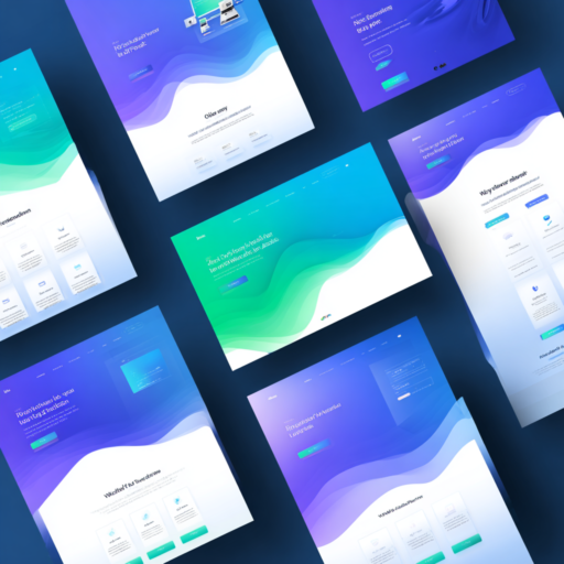
The half-page hero splits your screen strategically. Text and CTA on one side, contextual imagery on the other. It loads faster because the image is smaller. Moreover, it guides the eye naturally from message to action.
I implemented this on a healthcare platform redesign. Load times dropped 60%. Conversion rates increased 23%. The client initially pushed back, wanting something “more impressive.” The numbers changed their mind.
The Text-Only Approach Nobody Expected
This sounds wild, but hear me out. What if you just deleted the hero image entirely?
Consider what happens when you force yourself to communicate value through words alone. You can’t hide behind generic stock photography. You need a headline that actually means something. Additionally, you need to be crystal clear about what you offer.
I tested this on a SaaS landing page. Bold typography, strong color contrast, immediate call-to-action. No images in the hero section. The page loaded instantly.
The results shocked everyone. Bounce rate dropped 31%. Time to first interaction decreased by half. Furthermore, user feedback consistently mentioned how “clear” and “straightforward” the experience felt. Nobody mentioned missing the hero image.
When Search Beats Storytelling
Here’s another uncomfortable truth. If you run a marketplace, travel site, or complex platform, your users probably don’t want your brand story. They want a search bar.
Google trained an entire generation to expect search as the primary interface. Amazon reinforced this. Therefore, showing someone a video about your company mission when they’re trying to find a product is just friction.
Airbnb figured this out years ago. Their homepage isn’t about celebrating travel. It’s a search interface that asks “Where are you going?” Users appreciate the respect for their time. Moreover, they convert faster because the journey starts immediately.
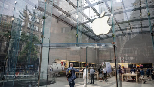
When Hero Images Still Work
Now, let me push back on myself. There are situations where a strong visual hero makes complete sense.
Luxury brands selling aspiration need that visual punch. Apple can get away with massive product photography because the product itself is the message. Likewise, high-end hospitality sites need to communicate ambiance and experience.
But here’s the key difference. Those brands have massive recognition and trust already built in. They’re not trying to explain what they do. Furthermore, their target audience is willing to wait for high-quality visuals.
For the rest of us? We’re competing for attention in a saturated market. Users don’t owe us patience. Therefore, we need to earn their time with speed and clarity, not pretty pictures.
The Business Case for Speed
Let’s talk about what actually matters to your business. Conversion rates, user engagement, search rankings, revenue.
A comprehensive Portent study found that sites loading in 1 second have conversion rates 3 times higher than sites loading in 5 seconds. That’s the difference between success and failure for many businesses.
Moreover, faster sites rank better in search results. Google’s algorithm explicitly prioritizes page experience through Core Web Vitals. Consequently, your beautiful hero section might be invisible because nobody can find your site.
Research from Blogging Wizard found that for every additional second of load time, conversions drop by approximately 7%. If you’re a $10 million e-commerce business, a 2-second improvement could mean an additional $1.4 million annually.
What I’m Doing Differently Now
These days, my design process starts with a different question. Instead of “What will look impressive?”, I ask “What will help users accomplish their goal fastest?”
I prototype with performance budgets built in from day one. No image gets approved unless it’s properly optimized and genuinely essential. Additionally, I test load times on actual mobile devices with throttled connections.
The results speak for themselves. Projects ship faster. Clients see better metrics. Users get what they need without friction.
Does this mean every site needs to be boring? Absolutely not. However, it does mean that aesthetics should serve usability and business goals, not the other way around.
The Uncomfortable Question
Here’s what I want you to think about. When was the last time you actually measured how your hero section performs? Not how it looks in presentations. But actual user behavior data.
Time to first contentful paint. Bounce rate by traffic source. Conversion rate compared to competitors. User session recordings showing how people actually interact with your site.
If you haven’t looked at this data, you’re designing blind. Furthermore, you’re likely prioritizing the wrong things based on opinions rather than user behavior.
The Speed Psychology
There’s a psychological component to site speed that goes beyond bounce rates. Fast sites feel premium, polished, and trustworthy. Slow sites feel janky and unprofessional, regardless of how much you spent on design.
Research shows users form opinions about website credibility in 50 milliseconds. Load time is a huge part of that instant judgment. A site that loads quickly signals competence and respect for the user’s time.
According to conversion rate optimization research, nearly 70% of consumers admit that page speed impacts their willingness to buy. That’s the majority of your potential customers making purchase decisions based on load time.
Mobile Changes Everything
Mobile devices now account for over 54% of web traffic worldwide. Yet mobile page load speeds are significantly worse than desktop, with pages loading 70.9% slower on mobile devices.
This creates a compounding problem. Your largest audience segment is accessing your site on the slowest connection, and you’re serving them a massive hero image optimized for desktop. It’s almost designed to fail.
A recent study found that 47% of smartphone users now expect websites to load in 2 seconds or less, down from 4 seconds just a few years ago. Expectations are getting stricter, not more forgiving.
The Bottom Line
Your website isn’t art hanging in a gallery. It’s a tool designed to accomplish specific business objectives. Tools need to work efficiently, not just look good.
I spent years designing for the boardroom instead of the user. My portfolio looked great. My projects won design awards. But the honest truth? Many didn’t perform as well as they should have because I prioritized the wrong metrics.
The shift to speed-first design isn’t about giving up on aesthetics. It’s about understanding that in 2025, speed IS part of the aesthetic experience. Moreover, a site that respects users’ time builds trust faster than any hero image ever could.
So yeah, I’m guilty of all these mistakes. I’ve created plenty of full-screen hero sections that probably cost my clients conversions and revenue. But I learned from the data. Therefore, I’m sharing this so you don’t have to learn the hard way.
Where to Start Right Now
If you’re looking at your site right now and realizing your hero section might be a problem, here’s what to do.
First, run a Google PageSpeed Insights test on your most important landing pages. Look at your mobile load times and Core Web Vitals scores. Check your bounce rates in Google Analytics.
Then ask yourself honestly: Is that hero image worth it? Is it communicating something essential that can’t be said faster? Or is it just there because it’s always been there?
The answer might surprise you when you look at actual data rather than assumptions. Moreover, your users might thank you for being brave enough to change it.
The Future Is Fast
Looking ahead, the trends are clear. Minimalist approaches with content-first strategies are dominating successful websites across industries. Text-only layouts are making a comeback, especially where information delivery matters more than visual spectacle.
The reason is simple. People want information fast. They want clear value propositions immediately visible. They want obvious next steps without hunting through navigation.
This doesn’t mean design doesn’t matter. It means good design in 2025 is defined differently. Good design loads fast, communicates clearly, removes friction, and helps people accomplish their goals effortlessly.